Over the past year, I've been making significant performance improvements to axe-core. A few of our rules were very slow on large pages (10k+ DOM nodes), and could even freeze the page if it was too large. Slowly but surely I've been able to greatly improve the performance of all but one of these rules.
A few weeks ago we merged the largest and most significant performance improvement to axe-core, a culmination of over 6 months of work, and were finally able to resolve the slowest rule we had: color-contrast.
I wanted to take some time to talk about the work that went into improving the performance of the rule. But before I can talk about how we solved the problem, you need to understand how calculating color-contrast works, and why that caused it to be slow.
How to Calculate Color-Contrast
Calculating the contrast between the foreground and background colors of a element isn't a straight forward problem. Getting the foreground color is relatively easy as you can just look at the elements color CSS property. Getting the background color of an element is a bit more involved.
To get the background color you need to know the elements visual DOM stack, which is all elements that visually overlap the element sorted by their visual order.
Without CSS involved, this is just the element and all of its ancestors. But positioned elements, negative margins, and transforms can add or remove elements from the stack. For example, an absolutely positioned element can be anywhere on the page and not just visually above its parent element.
Once you have all the elements of the stack, you can look for the closest one that defines a background color, or use the browsers default if none is defined.
Luckily we don't have to calculate the visual stack ourselves as the browser provides a very handy API called document.elementsFromPoint which returns the visual DOM stack. This is what axe-core uses to get the element stack and run our calculations on.
Why Color-Contrast Was Slow
To figure out why the rule was so slow, I ran a performance audit on the code. Using a performance analyzer, I was able to use the resulting flame graph to see where the most time was being spent in the code. What it showed me was that two browser APIs were taking the most time: elementsFromPoint and scrollIntoView.
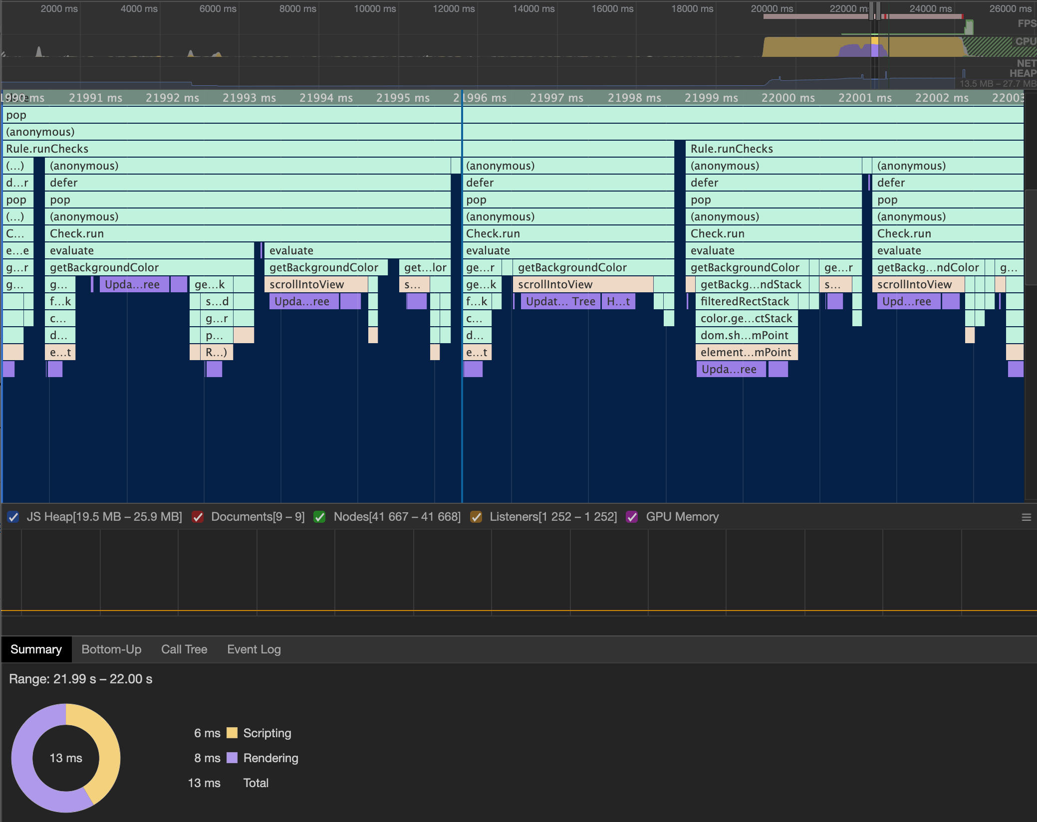
scrollIntoView and elementsFromPoint caused a rerendering of the page, resulting in over half the time spent on the rule. Click for larger imageNow the reason we were calling scrollIntoView is because the coordinates passed to elementsFromPoint must be within the current viewport (otherwise an empty stack is returned). This means that for every element that is offscreen, we have to scroll the element into view first so we can then call elementsFromPoint on its coordinates.
From the flame graph we can see that those two APIs themselves aren't taking the most time (they aren't the last thing in the column), but that each of the APIs cause the browser to rerender. Rerendering a large page is not quick, and having to do it twice for every element on the page was causing the huge bottleneck in our code.
How We Fixed It
Now that I understood why the color-contrast rule was slow, I needed to figure out if there was a faster way to calculate the element stack that didn't rely on scrolling the element into view and calling elementsFromPoint. This wasn't an easy problem as I had to come up with a more performant solution for a browser API, one that didn't trigger rerendering.
While thinking about this problem, I remembered the old Firefox 3D DOM Visualizer, which essentially showed the element stack. Looking at it reminded me of some of the simple HTML games I've created where the sprites are just rectangles.
This gave me the idea to treat each element as a sprite and perform collision detection on them to determine if they collide (or stack) with one another. Any elements that collided would be part of the same visually stack.
However, running collision detection on every element against every other element would be a very slow operation, possibly even slower than our current code. Thankfully I already knew how to solve collision detection performance problems through a technique called spatial partitioning.
Spatial partitioning is a technique where you divide a space into equal parts and assign each element into one of the parts. Then when you want to run a check, you only need to look at the elements that share the same space. This can help improve performance since you are running the collision check against significantly fewer elements.
Using a Quadtree
I first attempted to use a quadtree to group all the elements on the page. In a quadtree you divide the space into 4 equal parts (hence the name quad). Each of these parts can be further subdivided into 4 equal parts if they contain more elements than a predefined threshold. Spaces can keep subdividing until a max depth is reached or there are no more elements to add.
Unfortunately, through lots of testing I found that a quadtree took far too long to populate to make it a viable solution on large pages. With 50k+ elements on a page, the quadtree was continually divided and subdivided. Each time it divided I had to recalculate each elements position and add them to their appropriate subdivision.
In total, it took around 5 seconds to finalize and then another 5 seconds to process all the stacks. Although this was better than freezing the browser, I knew it could be faster.
Using a 2D Grid
I decided to try a simpler approach and create a 2D grid of the page and assign each element to every cell of the grid it belonged to. Then when I needed the stack I would just look at a single grid cell and run a collision check on just those elements.
This proved much faster than the quadtree approach, but I ran into a few problems when elements had scroll regions. Because of the scroll, elements inside scroll regions are not on the same coordinate system as other elements on the page.
For example, an element with a scroll region could visually be only a few hundred pixels tall, but the entire height of the scroll region could be a thousand pixels tall. Only the elements that are inside the current scroll area take up visual space while all of the other elements are essentially hidden. However, elements outside the scroll area could still contribute to the background color of it.
To handle this, I decided to treat each scroll region as its own separate grid. When I encountered an element with a scroll region, I would add the element to the grid as normal. Then I would create a subgrid for that element and add all of its descendants to just the subgrid.
When I wanted to find all elements that belong to the same stack, I would first look at the current elements grid and find all elements that collided with it. Then if the element had a parent grid, I would look the parent grid and find all elements that collided with the parent scroll region, and so forth and so on.
Doing this allowed me to treat each scroll region as it's own collision space and accurately determine the elements visually stack.
Visually Sorting the Stack
Now that the page was visually grouped, I had to finish the process by visually sorting all the elements in the stack.
Sorting elements visually is a lot harder than grouping them by their position. I had to understand exactly how a browser renders a page in order to mimic that rendering though JavaScript. This meant understanding stacking contexts and how CSS properties could affect the visual position of elements.
Without CSS involved, visual sorting is mostly just calculating the position of the element in the DOM compared to another element. Any element that comes after another is higher in the visual order. For this, I used the browser API Node.compareDocumentPosition to know which elements came after another.
With CSS involved, I also had to manually calculate stacking contexts and CSS position layouts to determine the visual order. Thankfully MDN has great docs on how browsers visually sort elements so I was able to use them as a base reference while writing the code.
One fun problem I ran into was handling positioning of Shadow DOM elements. I discovered that when using compareDocumentPosition on elements in two different DOM trees, it does not correctly return the elements position. Instead, the element in the Shadow DOM would always return as coming after any other element, including the HTML element.
To handle this, I had to walk up each of the DOM trees of the elements until I found a DOM tree they both shared. Then I could compare the position of the respective parent elements in the shared tree to know which element came after the other in the different trees.
<div>
  <div>
    #shadow-dom
      <span id="A">Element A</span>
  </div>
  <span id="B">Element B</span>
</div>
In the above example, #A and #B are in two different DOM trees (as #A is in a Shadow DOM). #A's parent element shares the same DOM tree as #B, so we can compare these two elements to each other. This allows us to know that #B comes after #A.
Visually sorting the stack took the most time to write and test as I had to do a ton of regression testing every time I made a change. Usually this involved running elementsFromPoint on a lot of pages and then comparing the results to what my code produced.
Doing this did find an interesting discrepancy between how Firefox and Chrome calculate elementsFromPoint though.
From the best that I can tell, there is a very interesting edge case in how the browsers treat floating point numbers when determining which elements belong to a stack. In Chrome they seem to round up the number while in Firefox they keep the number as is. This can cause the browsers to return different results (an element belonging to the stack in Chrome is missing in Firefox).
For our code, I decided not to round the number, mimicking Firefoxs approach.
Memory Use
Now we can't talk about improving speed without also talking about memory consumption. Improving speed usually comes at the cost of increased memory as you are caching information to improve speed.
So how much memory does saving every element into the 2D grid (and respective subgrids) take? I took three heap snapshots of a large site (10k+ nodes) to find out.
The first was when the page was loaded and the axe script was on the page but not run. This gave me a baseline to see how much memory the page used by itself.
The next was after running axe but without creating the 2D grid. The last one was after axe had created the 2D grid.
Now typically axe cleans itself up after a run so there won't be an increase of memory use after it finishes. To compensate for this I made sure to save off axes internal data during the run so I could look at it after the run completed.
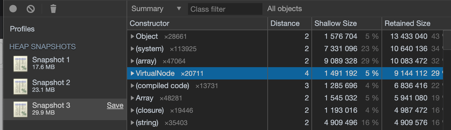
From the snapshots we can see that the page itself has a baseline memory use of 17.6 MB (with axe on the page). After running axe but without creating the 2D grid it uses 23.1 MB, an increase of 5.5 MB. Axe with the 2D grid causes the page to use 29.9 MB, an increase of 6.8 MB from axes normal memory use.
This means that creating the 2D grid and saving all elements to their respective cells doubles the memory use of axe from 5.5 MB to 12.3 MB.
Is this a problem? We didn't think so. Doubling our memory footprint on very large sites in exchange for actually being able to run the rule in a decent amount of time is worth the memory trade off. However, it's good to keep that in mind as we move forward so we don't continue to use too much memory.
Final Result
After getting the code to work to my satisfaction, and trying to optimize it to the best I could, I was able to get the rule to complete in 5 seconds on even the largest of pages (50k+ nodes).
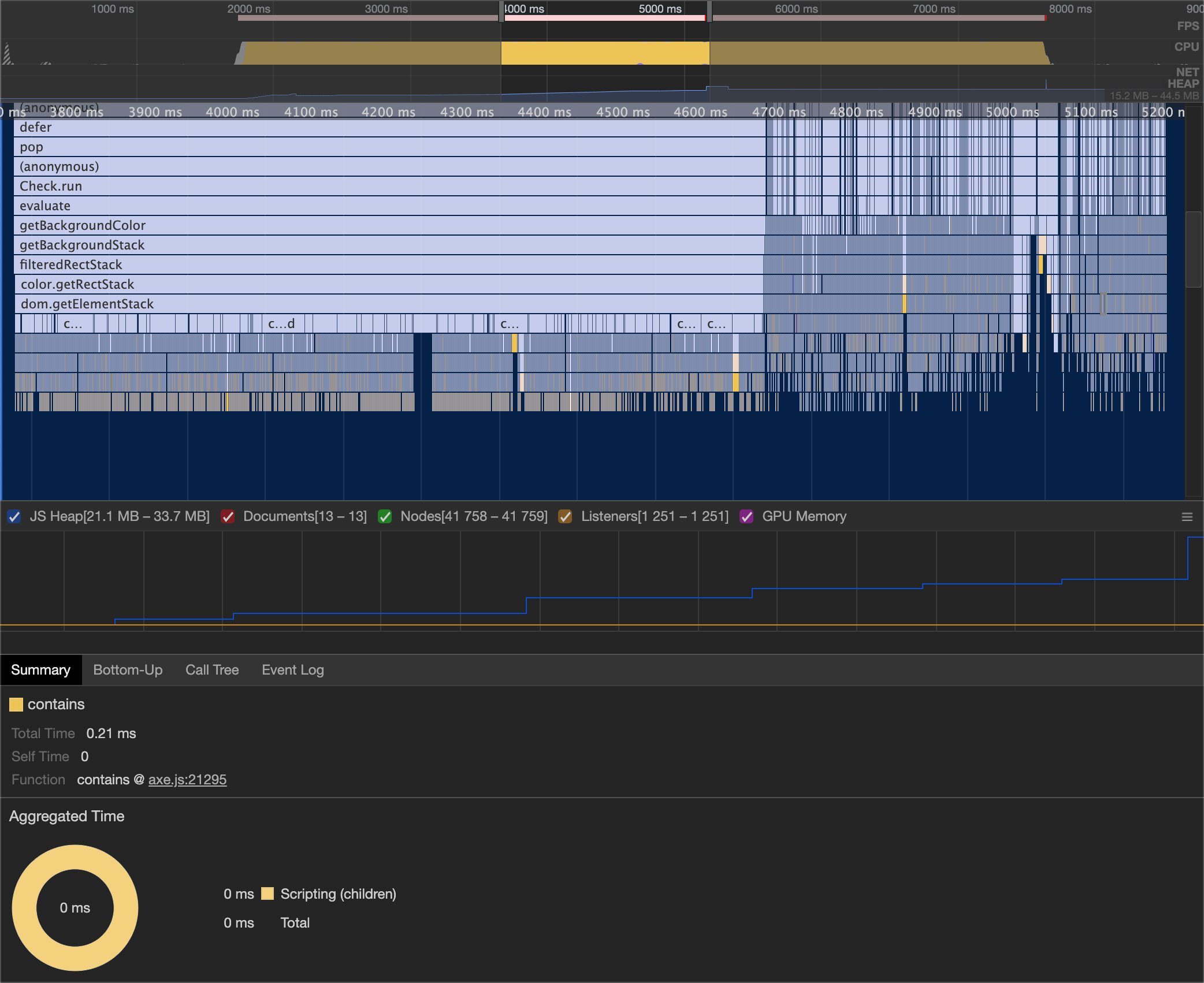
From the flame graph you can see that the call to dom.getElementStack takes about one second to complete, and then a lot of very narrow stacks for each element. The getElementStack function is what kicks off creating and populating to the 2D grid. Furthermore, we can see that the code is no longer triggering rerendering anywhere during the run.
If you're interested in trying out the new code, you can download it from NPM using the next tag or use axe-coconut. If you find any problems with the color-contrast results, please file an issue so we can fix it. I expect there to be a few kinks to work out.