Last month I participated in the Js13kGames competition. The premise of the competition is to create a game in one month that is no larger than 13KB (zipped). I've participated many times in the past and this makes my 6th entry to the yearly competition.
Now that the competition has finished, I wanted to take some time to discuss how I came up with the concept of my flip and write style game The Encroaching Darkness, how I designed it, the problems I had to solve, and how I executed the idea.
But first, if you haven't played the game yet you should head over to the competition site and play it a few times. It's free to play in the browser and only takes a few minutes. I'll wait.
Finished? Great! Let's begin.
How I Came Up With The Concept
This years theme for the competition was Triskaidekaphobia, the fear of the number 13. This was the 13th year of the competition so it was a very fitting theme.
As I thought about what game I could make that would incorporate the theme and how limited my time would be this year to participate, I decided I wanted to try making a small game that could easily be a board game. I decided that I wanted to try to make a city building style game as well. I seem to be enjoying those lately since I made Osteopolis for last years competition.
I started by looking at other games that I enjoy that would be similar to the style I wanted to make. I looked at Everdell, San Juan, Roll Through the Ages, Era: Medieval Age, Against the Storm, Frostpunk, ISLANDERS, Foundation, and Tiny Islands.
I made a list of the things I liked about the games and could maybe incorporate into my own game. I've always wanted to make a game that was like Tiny Islands in both scope and size, so I thought I would start with a game about placing buildings on a grid.
From city builders like Foundation and Frostpunk I looked at how people had needs that you had to meet. From Against the Storm I looked at how it played with buildings being randomly given to the player. From Era: Medieval Age and Roll Through the Ages I looked at the disasters and gaining resources through dice rolls.
From San Juan I looked at how the cards were both buildings and the resources needed to build them. Lastly from ISLANDERS and Tiny Islands I looked at building placement requirements and scoring based on surrounding buildings and features.
With all these things I came up with an initial idea of making a survival style city building (another style of game I like since I made Ravaged Space for the Australian Bushfire Charity Jam). I wanted a game that had the same type of constant threat mechanic like Frostpunk and its cold. Something that started as a minor threat, but not too difficult to manage, but that would quickly escalate into a serious problem that you had to plan how to deal with.
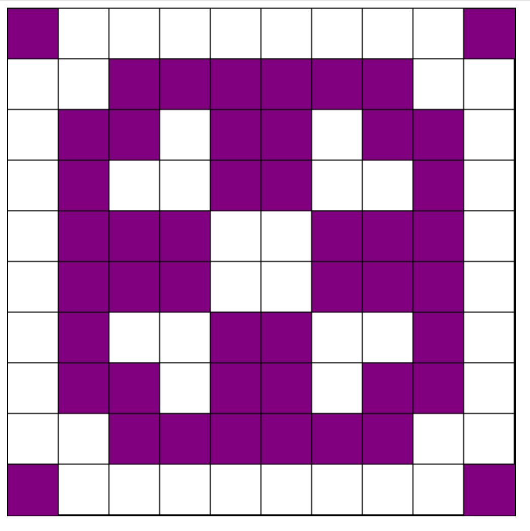
I decided to incorporate the fear part of the theme and thought about how fear can be overwhelming. This lead to the idea to use darkness as the mechanic and that it would spread or grow over time to start swallowing up the tiles on the board.
Designing the Game
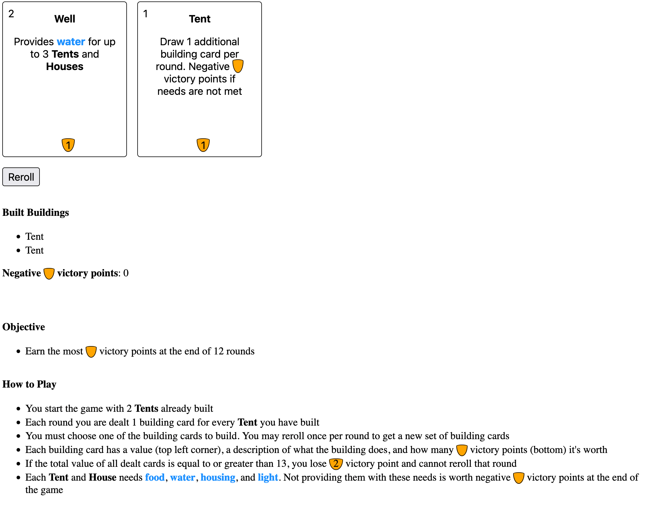
With the main threat mechanic and style of game decided on, I next wanted to come up with how the game would be played. My first idea was that you would place houses on the board and each house would have needs, like food and water. You would then need to place down other buildings that satisfied these needs.
I also wanted a sort of resource mechanic that wasn't number based. After all any number that counted up would eventually reach 13, which I wanted to avoid due to the theme. Games like Era: Medieval Age restrict how many of a resource you can have, but I didn't want to track resources as that would add more noise to the game than I wanted.
I decided to try an idea where certain buildings were unavailable until you had built another building first. For example you couldn't build a building that required wood without first building the building that produced the wood. That lead to the lumber mill and stone mason buildings to unlock wood and stone buildings.
I wanted to have the buildings that come up be random, similar to Tiny Islands and Against the Storm. I came up with the idea to incorporate the number 13 part of the theme by assigning each building a value, and if the total value of the drawn cards was 13 or more then that would be how the darkness would spread.
I also wanted some sort of push your luck mechanic so decided that the number of houses would dictate how many buildings would be dealt each round. By building more houses to score more points, you also increased the chance of spreading the darkness.
That was enough of the game to start paper prototyping. I played a few games on paper and the concept was interesting. I had someone else try it out as well, and then coded up a quick prototype that I shared with the Js13k community. For the prototype I simplified everything down to just what I wanted to test, which was drawing cards and what happens when you draw over 13 in value.

Those who played the prototype thought the concept was interesting, so I moved forward with the idea and started fleshing out the game more.
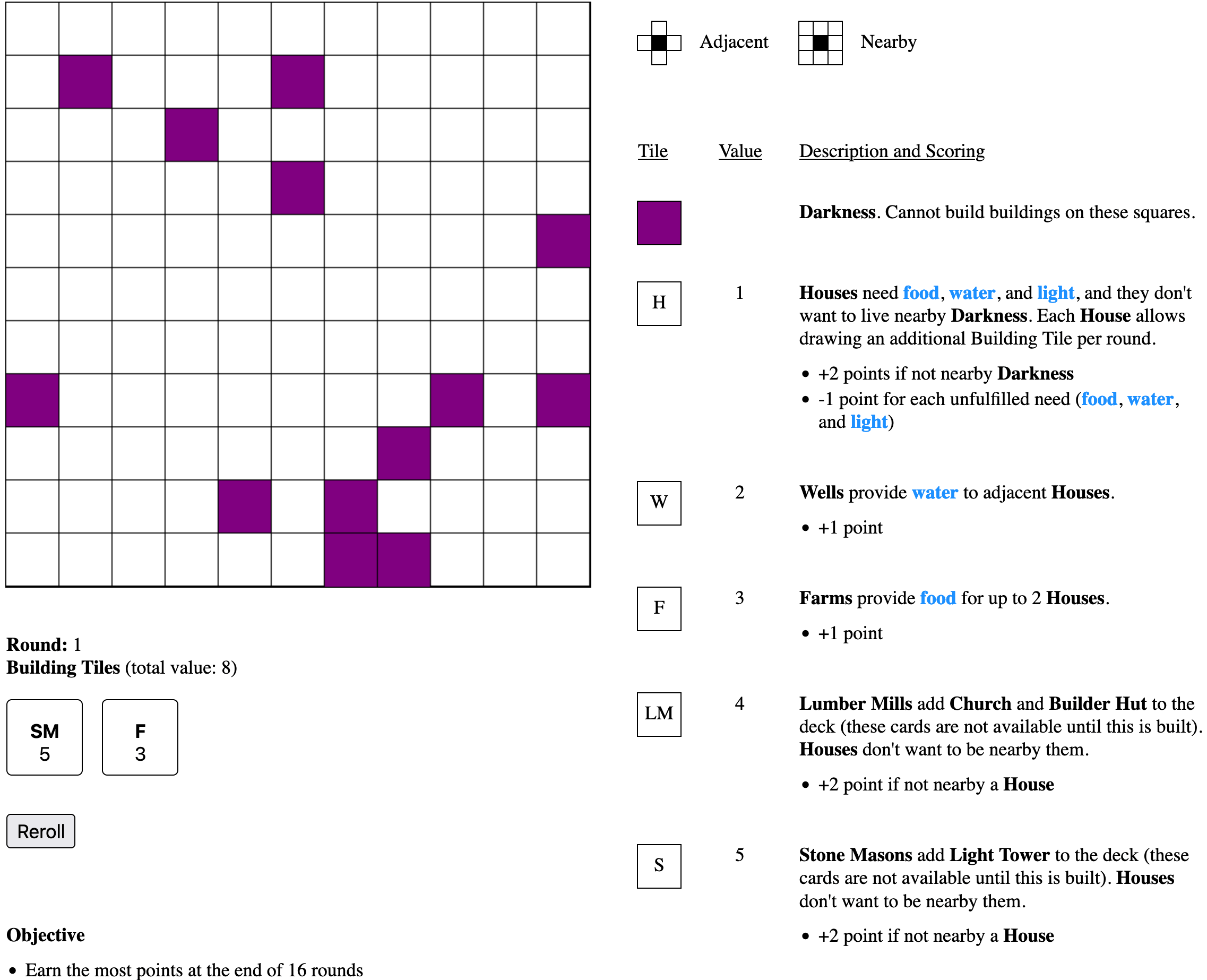
I worked on making buildings score via adjacency to other buildings, and made buildings only satisfy the needs of houses based on being adjacent. I worked on what buildings to have and came up with a list of 8 I thought might work and how they would score.
- Houses would gain you lots of points but also have needs of water, food, and light. Not satisfying these needs would lose you points
- Wells would provide water but only to adjacent houses
- Farms would provide food to any house on the map, but only up to 2 houses per farm
- Lumber mills would allow you to build buildings that required wood
- Stone masons would allow you to build buildings that required stone
- Churches required a lumber mill before they're available and would help mitigate the problem of drawing too many cards by reducing the total value the cards by 3
- Builder Huts required a lumber mill before they're available and would let you build a 2nd building each round
- Light Towers required a stone mason before they're available and would provide light to any nearby houses. They would also push back the darkness, preventing it from spreading into adjacent tiles. Light towers are there to help mitigate the darkness spreading where you don't want it to
I had other ideas for buildings that could be used, such as walls, but decided they made the game more complex than I wanted.
I also worked on figuring out the size of board I wanted the game to play on and how the darkness would start on the board and spread. I started with a 10x10 board (for no particular reason) and tried to think about how to randomly place the darkness. I thought it would be interesting if the darkness could start on any tile that was a multiple of 13, in any direction of row and column. Then I would pick 13 of them at random for the starting placement.

When the darkness spread the game would choose a random darkness tile and have it spread into one of its adjacent tiles.
I did a lot more paper prototyping with others, trying to figure out how to score buildings that felt good. I initially had a lot of the buildings give both positive and negative points depending on placement, similar to ISLANDERS. I went through many iterations of changing the scoring. I eventually decided to remove all of the negative point scoring as it made things too complicated.
I also decided that a 10x10 board was too small to fit everything, especially if you wanted to place buildings a few tiles away from the darkness. So I increased the board size to 11x11 to give more breathing room.
After paper prototyping a bunch, I updated the online version and sent out another round of prototyping to the community.

Finding the Fun
It was during this time that I was feeling that the game wasn't fun to play. There were a few things that contributed to that feeling.
The first was that it was too easy to play conservatively and never draw more than 2 cards the entire game. This would almost guarantee that you would never draw more than 13 total value so the darkness would never spread. I wanted the darkness to be a constant threat so I didn't want the players to feel like it was more of an inconvenience.
The second was that the way buildings worked and scored wasn't working. The lumber mill and stone mason were no longer needed after you built them once, so when they showed up again it felt like a wasted draw.
Houses were also problematic. Since they would increase how many cards you would draw per round no one wanted to build more of them since it would increase the chance for the darkness to spread.
The third and more major problem was that it wasn't interesting to place the buildings. You could always place your buildings in an optimal way and the way buildings scored wasn't in and of itself providing enough strategy and fun.
With a few weeks left of the competition I needed to figure these things out.
Making the Darkness more Threatening
The first thing I decided to tackle was the darkness. I tried a few different approaches to make the darkness more threatening.
Since the darkness was spreading too slowly I decided to spread it multiple times every time the total value of the cards was 13 or more. That didn't work as it caused the darkness to get out of hand really quickly.
I next tried making the darkness spread to every adjacent tile instead of just 1. This made it spread too quickly when combined with spreading multiple times, so I reverted to just spreading it once every time.
That fixed the problem with how the darkness spread, but it still didn't address the problem of players playing conservatively. I decided to try having the darkness spread at the end of every round. Having a negative effect happen at the end of every turn is a popular mechanic in coop style board games such as Pandemic and Flash Point.
Having the darkness spread every turn made all the difference to how threatening the darkness was. Now players had no choice about when it spread and instead had to plan how they wouldn't spread it further.
The last thing I did was encourage the darkness to spread as much as it could every time. The problem I was finding was that half way through the game the darkness would merge into a big glob and the majority of darkness tiles would then only have 1 or 2 other tiles it could spread into.
I didn't like how it felt when the darkness barely spread, so I programmed it to sort the darkness tiles by how many neighboring tiles it could spread into, then biased the random number generator to favor tiles that had the greatest number of spreadable tiles. This helped the darkness feel constantly threatening rather than tapering off near the end game.
Hindering the Optimal Play
Next up was figuring out how to stop players from playing optimally every game. In Tiny Islands the tiles have restrictions on where they can be played, restricted to a certain row, column, or area. I didn't want to copy Tiny Islands mechanic so I tried to think of something I could do.
After a week of pondering on it I had the thought of restricting building placement on the board using their values. This made me think of the game Sodoku where you play in a 9x9 grid and each of the numbers 1-9 can only show up in any row, column, or 3x3 group exactly once.
I tried implementing a similar concept to my game where each building could only be placed in any row, column, or 3x3 group exactly once, but it made the game too restrictive in building placement. I looked at other games similar to Sodoku to get more ideas on how to play with numbers, such as Kakuro and Futoshiki, but I wasn't able to come up with anything that worked.
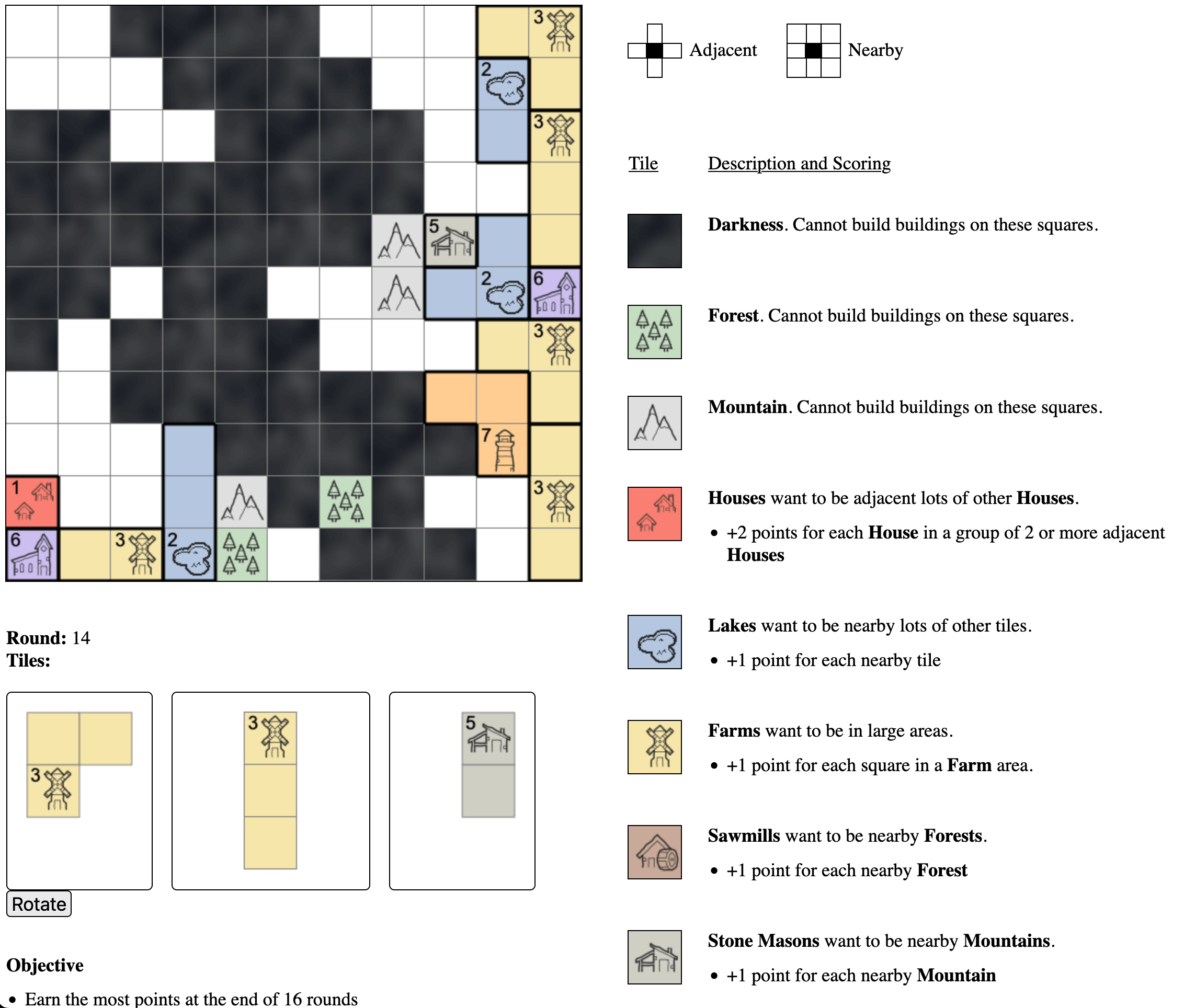
While looking up similar games I stumbled upon Jigsaw Sudoku, which uses irregular shapes for the area bounds rather than a 3x3 group. This made me think about having my buildings take up an area rather than just be a 1x1 tile. I immediately thought of using Tetris like pieces for the buildings, and quickly prototyped a version of the game using 3 piece tetrominoes. After the first game I knew I had what I wanted.
I also kept the concept of Sokoban row and column rules, but instead of restricting play it instead counted the values of the buildings in the same row and column and if they totaled 13 or more the darkness would spread.
Changing the Way Buildings Worked
To try to fix the buildings, I tried changing how lumber mills and stone masons worked. Instead of automatically unlocking the church and light tower, I decided to make each building have a percent chance of being drawn. The lumber mill and stone mason would then increase the percent chance of the church and light tower. That way you would be incentivized to build them more than once.
However this change didn't seem to work. Players would try to build stone masons to get light towers, but when light towers didn't show up the players felt like the mechanic wasn't working. I tried adjusting the percent increase many times but in the end nothing was working.
I finally decided to just drop the mechanic of locking out the church and light house and instead just made every building equally likely to be drawn.
The farm and well also suffered from the same problem that once you had enough to satisfy all the needs of your houses, you didn't really want to build more of them. After some time I decided to remove the needs system completely. This meant that houses wouldn't require needs and buildings wouldn't satisfy anything.
Lastly the church's mechanic of reducing the total value of the buildings was too complex so I removed it, and I removed the builder hut as I no longer felt I needed to give players a way to build multiple times per round.
Improving the Scoring
With all the changes to buildings and placement, I also needed to fix how the buildings scored.
To improve the scoring I looked at games like Cartographers, Era: Medieval Age, and Carcassonne. I wanted to make how buildings scored be unique and interesting and not just always have it score based on being adjacent to other things.
One of the first changes I made was to replace the well with a lake since they didn't need to provide water to houses. I figured lakes are more interesting when they are surrounded by many features, so I decided to score it like the Monastery from Carcassonne where it gain a point for every nearby building or feature. This made the lake a building you wanted to cluster around other things.
For the lumber mill and stone mason I added trees and mountains to the board and chose to make them gain points based on being nearby them (respectively). Unfortunately this made them essentially function the exact same, so I'm not entirely happy with it but I was running out of time at this point so left it as is.
I thought houses would like to be clustered together, so chose to score them based on clusters of adjacent houses. This is similar to how the Forests work in Tiny Islands and Villages in Cartographers.
Farms benefit from being larger (since they can feed more people) so for a different way to score I decided to use the area of the farm shape for the scoring. The more area the farm has the more it scores. This encourages you to place the larger tiles instead of always choosing smaller ones to fit better.
For the church and light tower, again due to lack of time, I just took some scoring concepts from Tiny Islands. Churches should be placed far away from the darkness (similar to boats) and light towers shouldn't be in the same row or column as another light tower (similar to waves).
Finishing Touches
With the game now settled I tested it a few times with others and everyone loved it.
With only a few days left before the deadline, it was time to finish the last two missing parts: art and final scoring. Up until this point I never had implemented the final scoring as I was focused on the main game mechanics.
I started by looking for images to use for the buildings. I looked at a few of my favorite sites to grab assets from: OpenGameArt, Flaticon, Game-icons.net, and Kenney. I couldn't find icons in the first 3 sites, but I stumbled upon Kenney's Cartographer Pack which was the style I was hoping for and had all the buildings I needed.
I knew that the game would be confusing to understand at first, and that I didn't have enough time to try to create a tutorial or explain the game any better than my initial prototype UI (which was a mess). I needed a way to make sure that the players understood how buildings scored at least at the end so that they would be encouraged to play again.
I once again took inspiration from Tiny Islands and used its scoring animation to teach the player how the buildings worked. It worked out really well and I was able to get it working a few hours before the deadline.

Game Reception
The game has been really well received during the competition. Players have commented that it's very replayable and fun. As I suspected the game takes players a few times before it really clicks, but it plays quickly enough that it hopefully hasn't deterred anyone from playing more than once.
The UI is still a mess since I ran out of time so I probably won't score very high in that category. But overall I'm extremely pleased with the game and how it turned out.
After the competition I plan to release a post-compo version of the game to itch.io. As always it'll focus on improving the UI and adding accessibility features. I plan to make it accessible to screen readers so players with limited to no vision can play it. I have an idea of how I'm going to make that work, but it'll take some testing to figure out how best to inform the player about the shapes of pieces.