Last month I participated in the Australian Bushfire Charity Jam. The premise of the game jam was to create a game in two weeks that would be sold as part of a bundle, with all proceeds going to bushfire related charities.
Now that the bundle sale has finished, I wanted to take some time to discuss how I came up with the concept of my incremental survival game Ravaged Space, how I designed it, and how I executed the idea.
But first, if you haven't played the game yet you should head over to itch.io and play it a few times. It's free to play in the browser and only takes a few minutes. I'll wait.
Finished? Great! Let's begin.
How I Came Up With The Concept
When I first heard about the game jam, my first idea wasn't Ravaged Space.
I had just heard the news story about how Wombats were saving other animals during the fires by sharing their burrows. I thought it'd be easy to create a game about a Wombat saving other animals from fires.
However, I wasn't really interested in the concept. I remembered playing a fun and simple incremental game called Dwarfs: There and Back Again and it made me want to make an incremental game myself. So I went back and played some other incremental games I enjoyed, such as A Dark Room and Seedship.
While brainstorming ideas on what the game should be about, I thought about why the game jam was created in the first place. Due to rapid climate change, the Earth is being destroyed. Thinking about that, I came up with an idea to model the game after climate change.
A game where you start off happily mining resources without really knowing what you're doing. Where you slowly come to realize that your actions have consequences and you are actively harming yourself. Where you can try to keep up with the high demand you have created but ultimately end up destroying yourself.
Until, that is, you realize that you should slow your pace, try to only consume what you need, and eventually switch over to an alternative source of power. Only then can you win.
If you've played the game, you should be able to see exactly how the game follows this model. You may not have realized it at the time, but you are very much playing a political commentary on climate change. Yep, I said it. I made a political game.
After coming up with this idea, I instantly liked how it would play out. The next step was designing it.
Designing an Incremental Survivor
For the feel of the game, I knew I wanted something that was a bit intense. Some threat that was looming over you, always forcing you to try to be a few steps ahead of it. You know, like climate change.
One thing I knew would be important was a quick feedback loop. The concept of the game was to fail your first few attempts. This meant I would need the game to be played in about 5 minute intervals. Otherwise if it took too long to fail, players would become discouraged at the time they lost and not want to keep playing.
Thinking on all of this, I thought about the game Seedship. I greatly admire the game for not only its great story telling, but also how the games mechanic is always pushing you forward. It also only takes a few minutes to play.
In the game, you need to find a planet rich in a variety of resources, but after each planet you visit you have a chance of damaging your ship. So the game becomes a balancing act of deciding which systems to damage in order to find a better planet. And in the end, your score is a direct result of what systems you were able to save.
So I decided to design my game heavily inspired by Seedship. I wanted to have a ship with different systems that could be damaged, a bit of story telling, and have the player balance efficiency vs. sustainability.
I started jotting down a few pages of notes on how to handle resources and how different systems could interact with one another. After I had refined the ideas down substantially, I started building prototypes to test them. This let me quickly iterate on the ideas until the feel of the game was were I wanted it.
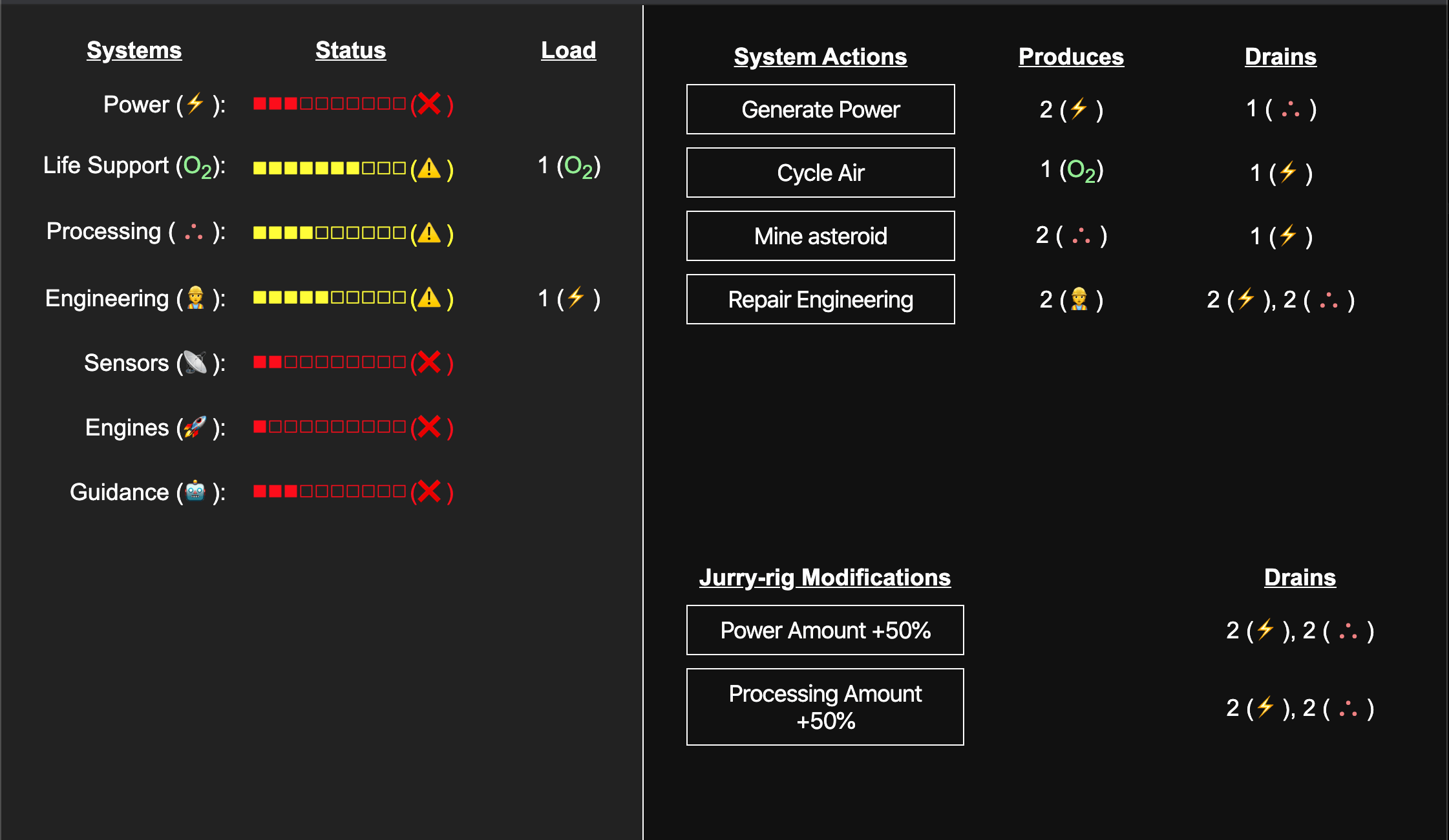
One of the concepts that I had to keep iterating on was the resource systems. I had initially designed it like most incremental games and let you collect an infinite amount of resources. However this hindered the feel of the game as you could just sit and mine forever. So I decided to change it and made the resources very limited.
This lead me to the idea of presenting the status of each system as a bar instead of a number. However, this was hard to balance for as it meant all systems combined couldn't put more than ten load on any one system.
I ended up creating a spreadsheet of all the systems to calculate how much power per second I would need to generate to offset the max load. I also listed the optimal path I thought the game should go and make sure it didn't require too much of any resource at a time, trying to stay around a net 0.
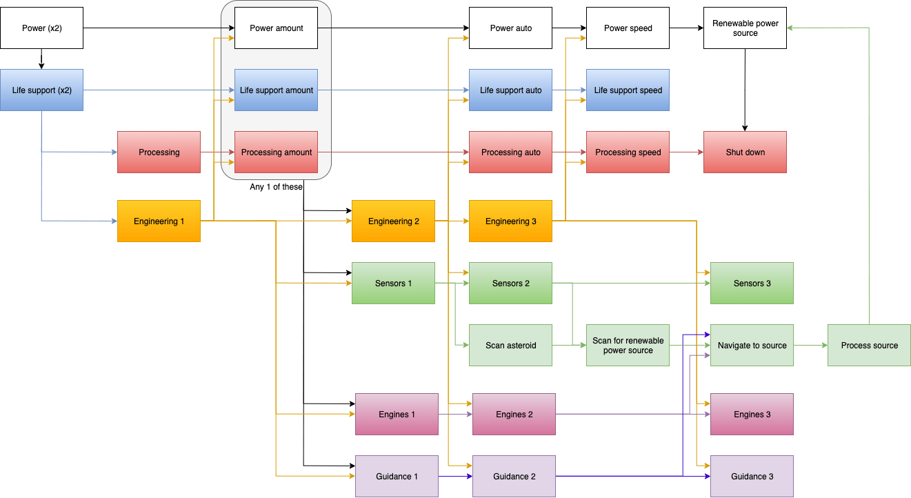
The last design step I did was to figure out a tech tree. I tried drawing the tech tree ideas on paper, but it was a bit tedious having to everything just to move boxes around. I found a free online flow chart tool called draw.io which I used to draw out my planned tech tree.
Programming the Game
While prototyping, I quickly realized that trying to hard code every interaction and UI change would become a nightmare to work with. I decided to create my own one-way data-binding. That way I could maintain all the information in a single state object and any time one of the properties changed, it would handle updating the UI accordingly.
The code for a one-way data-binding involved looking at every elements text content and attributes for the data-binding syntax (in my case, I used double brackets {{}}). The value of the data-binding was a dot-separated path to the property to bind to. The code would then register a callback that would be called any time the path was changed.
For example, if I wanted to bind to the value at systems.power.status, I would write
<div>{{systems.power.status}}</div>
At first it started as a simple property binding. But as the game progressed I added negation and the ability to call functions to transform the data I also added the ability to have the binding only fire once. That way I could populate some initial data but not have it update later.
I also discovered that when binding to HTML input values of number types (number, range, etc.), the browser would throw a warning about non-numeric content in the value attribute. So I created a data attribute data-bind to say which attribute to bind to.
<input type="range" data-bind-value="{{options.volume}}" />
Lastly, since I programmed the game with screen reader support in mind, I had to handle different properties when setting attributes. For example, a falsey value would remove the attribute, unless the value was 0 or if the attribute started with aria and the value was a boolean.
The final binding code is as follows (where event.on is the callback registration).
function setText(el, value) {
  el.innerHTML = value;
}

function setAttribute(el, name, value) {
  // set 0 as a valid attribute
  if (typeof value === 'number') {
    el.setAttribute(name, value);
  }
  // add truthy values or always set boolean aria options
  else if (value || (name.startsWith('aria') && typeof value === 'boolean')) {
    el.setAttribute(name, value);
  }
  // remove falsy values
  else {
    el.removeAttribute(name);
  }
}

// setup bindings. A binding is any string that starts and ends with {{}}, and
// the content is a dot-separated path. it can also start with ! (negation)
// and call a transform function using :functionName
// e.g. {{path.to.prop}} {{!path.to.prop}}, {{path.to.prop:transformFunction}}
const bindingRegex = /^\{\{\s?(!?)([\w.]+):?([\w]+)?\s?\}\}$/;
document.querySelectorAll('*').forEach(el => {

// text binding
if (bindingRegex.test(el.textContent)) {
  const match = el.textContent.match(bindingRegex);
  const negation = match[1];
  const path = match[2];
  const transform = match[3];

  const bindOnce = el.hasAttribute('data-bind-once');
  if (!bindOnce) {
    event.on(`${path}-changed`, newValue => {
      newValue = transform ? window[transform](newValue) : newValue;
      setText(el, negation ? !newValue : newValue);
    });
  }

  let currState = state.get(path);
  currState = transform ? window[transform](currState) : currState;
  setText(el, negation ? !currState : currState);
}

// attribute binding
Array.from(el.attributes)
  // no longer make it a live list
  .map(attr => ({ name: attr.name, value: attr.value }))
  .forEach(({ name, value }) => {
    if (bindingRegex.test(value)) {
      const match = value.match(bindingRegex);
      const negation = match[1];
      const path = match[2];

      // value attribute on some inputs (number, range, etc.) will throw a
      // warning about not being a valid number when set to a binding
      // string, so we'll create a binding pointer
      if (name.startsWith('data-bind')) {
        el.removeAttribute(name);
        name = name.split('-').pop();
      }

      event.on(`${path}-changed`, newValue => {
        setAttribute(el, name, negation ? !newValue : newValue);
      });

      const currState = state.get(path);
      setAttribute(el, name, negation ? !currState : currState);
    }
  });
The state code then fires all callbacks whenever a property is changed:
set(path, value) {
  const parts = path.split('.');
  let currPath = this._state;

  for (let i = 0; i < parts.length - 1; i++) {
    currPath = currPath[ parts[i] ] || {};
  }

  currPath[ parts[parts.length - 1]  ] = value;
  event.emit(`${path}-changed`, value);
}
With that, I could write most of the code in just HTML, with a few JavaScipt helpers to handle what should happen when buttons are clicked.
The tedious part of development was managing the large state object for the game. A lot of properties had to be duplicated among the different systems and actions. Adding, removing, or updating anything required editing it in multiple locations. In the end, the state object grew to be about 400 lines long!
It also didn't help that I was prototyping as I designed so I ended up refactoring the state object quite a few times.
In just one week, I was able to to get most of the basic interactions working and was able to focus on adding the tech tree and balancing for the second week. All while making sure I took lots of breaks to avoid burnout (I've burned out a few times on prior game jams).
Making the Interface More Understandable
When I first made the interface for Ravaged Space, it was written as two tables to help facilitate screen readers. I put each piece of information into it's own column, which ended up driving a lot of how the interface looked.
With only two weeks to design and develop the game, I didn't really have any time to playtest it. Which was unfortunate because, as I found out later, the UI was really confusing.
Due to the two table design, all the information was spread out too much. Players were so focused on the buttons in the right table they they didn't notice that the systems were being affected when they clicked the buttons.
Players also didn't understand that the buttons had a cost associated with them as that information was in two other columns. They also had trouble understanding system load and how it affected the game.
Lastly, players were often confused with the modification popups and didn't know what they were choosing between.
All in all, the UI was a mess.
While talking about this with other developers and designers at a local Indie Game Meetup, we came up with the idea to condense the UI as much as possible.
The action buttons moved next to the status so players could easily see what changed when they pressed them. Their cost was also added to the button so all the information was in a single place.
To help with system load, I added a cool pulsing effect to the status bar which shows how much of the resource you would lose on a load cycle. I also made it start slow and then get faster as the load cycle came closer.
I also made sure to add what exactly was changing to each modification popup button so it was clear what you were choosing between.
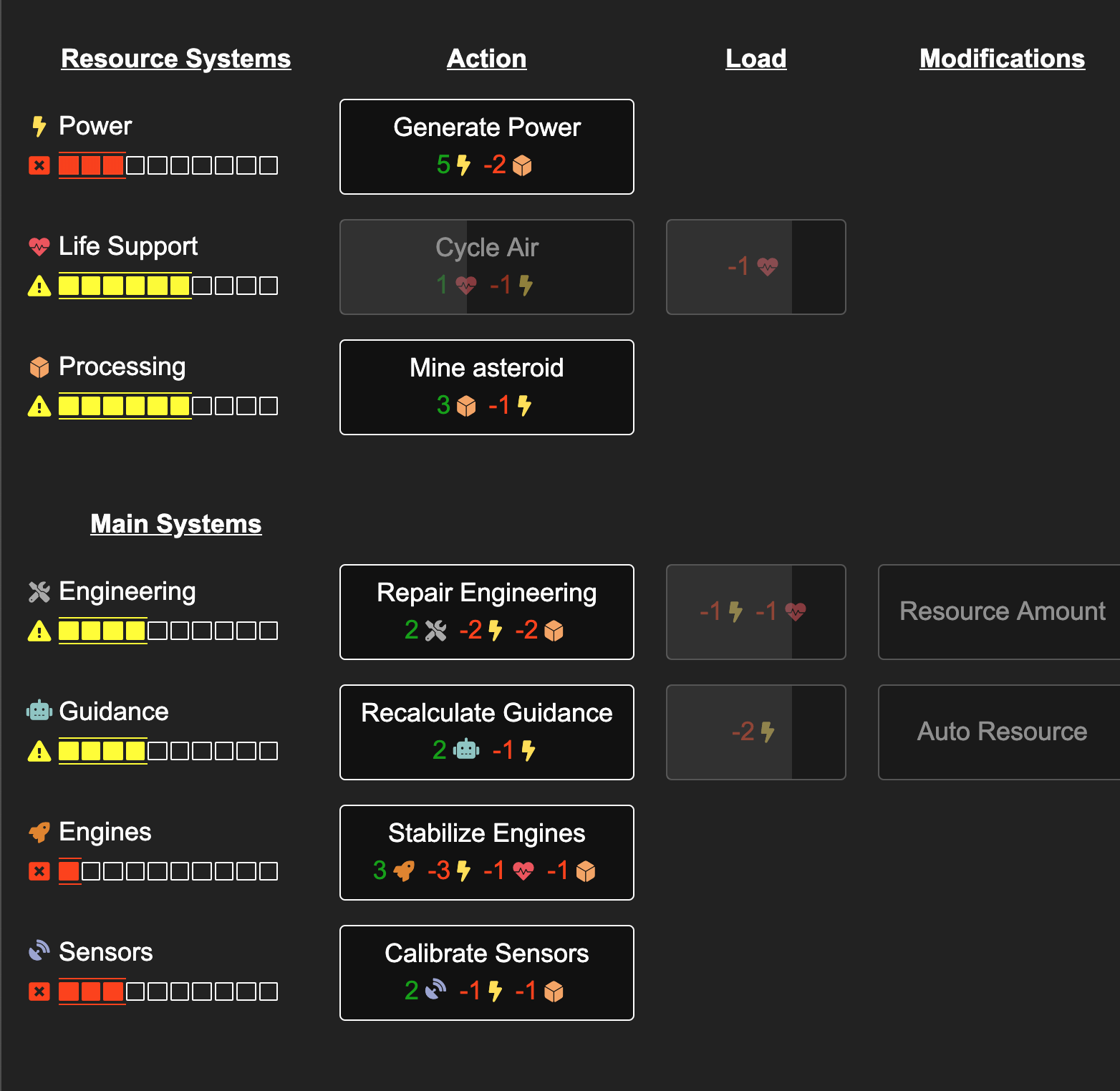
Playtesting has shown that the updated design is much easier to understand. It's still not perfect though.
I've noticed that players can easily miss when new systems add load, which causes them to lose but not understand why. Hopefully I can address this in the next update by trying to call attention to any changes in system load.
Conclusion
I am very pleased of how the game turned out. I don't often have a game where it goes exactly how I had planned it. It's also fun having the game give the exact feeling I wanted it to give. Others have felt this too and have reached out to say how much they've loved the game as well.